

Example #1:
Clorox
Mermaids, the essence of the imagination. Original, not so much, but complete genius when associating with a bleach commercial. This design of the ad is not only profound but stimulates the minds of the viewers by playing on the evoked set of childhood memories of playing in the bathtub. DDB San Francisco seriously created a stellar ad with this very strained, yet positively workable association.
Example #2:
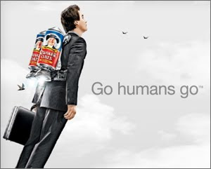
Quaker Oats
We all want to be superheros, right? So why don't we make an ad about it? Okay. Brilliant. Goodby Silverstein (San Francisco) of Omnicom, you did it again. This print ad screams art. Firstly, look at the realism of the man with the oatmeal jet pack...brilliant. As you get closer into observing the ad, there seems to be a theme of 2. A simple number, but nonetheless captivating. 2 simple words make this ad (honestly, it reminds me of Dr. Seuss) "go" and "humans." These are probably two of the most understood words in the English language. Also adding to the powers of 2, there are 2 jetpacks and 2 birds on the horizon, making the duplicity even more apparent in the ad. This fluidity of this number and consistency is what makes it art for me. That, and also the beauty of the clouds and color contrast. Everyt
hing is in hues of gray and the neutral color of skin, except the oatmeal, which calls more attention to the product.
Brilliant, simply brilliant.
Example #3:
Toyota Prius
This ad combines creativity with vertical advertising. Saatchi and Saatchi Los Angeles are responsible for this brilliance. By starting with the idea of those cute photographs of babies as flowers and taking it to a next step they have literally made the usually dull car commercial into a work of art. This success is taken to another level in creating instead of one cute baby picture into many and creating a living, human landscape. The synergy between these two ideas is extraordinary in this oz-worthy commercial.

Example #4:
Glassez Window Cleaner
I love the creativity represented in this ad. JWT in Spain receives the credit for this one. Not only do they take a completely exotic bird, but they do a new twist on the windex commercial. The bird is not flying into a wall, not talking, instead it seems...prepared. On another note, the bird is poised at the ready, and is the center of the visual...though not at the exact center of the ad, creating a unique way of filling space. In this case, although this is a commercial, the still version is simply a work of art through it's simplicity.
Example #5:
Citibank (India campaign)
This commercial speaks to me, and not only because I can't understand the language of the background song. As I was watching all the people sway on the commercial, I started to do the same thing. Throughout my experience, I was wondering why I was swaying so much when I realized that I had truly connected with an ad. It was an amazing feeling, and that is what art is about. This commercial illustrates the beauty of India, and then connects it by not only using English at the end but by the idea of a subway, and the swaying motion that we all feel by the experience. as far as I am concerned, this ad brings creativity and universality together, certainly making it a work of art from Publicis India group.
No comments:
Post a Comment