twitter
    Find out what I'm doing, Follow Me :)

Wednesday, September 30, 2009

OMNICOM...the name spells power.

OMNICOM, one of the largest holding companies in the world that literally is half responsible for basically controlling the advertising market (next to WPP group).  These companies have fused together some of the most well-known and well-received ads in the world with countless awards to their names.  Here are some examples from this mega company.

BBDO

     BBDO is famous for their Pepsi ads...though they always seem to follow the same criteria, but take it up a notch each time.  It is always a deserted area, there is always a celebrity, and mostly a "diss" to Coke.  However, with this ad they seem to have finally caught on to the Coke idea that it is important to talk about the positives...alas, Britney Spears still appears close to naked.

DDB
     
     DDB is responsible for bringing the VW to the point that it exists today with the "think small" campaign.  This ad brings the idea to the 21st century and has a fight scene and reminds me oddly of the Matrix...even the fighting yourself part.  This ad demonstrates how this company can keep a client satisfied with projects.  This ad was created by the London office, DDB London.  CLIO 2009 Bronze winner.

TBWA
     
     Thankfully, this company did recover from the boom (1984) and bust (Lemmings) and later boom (Hi I'm a Mac) of the Apple campaign and now makes clever and, in my opinion, bizarre ads.  This company seems to breathe weird, though not the freaky-weird but more of the clever-weird.  The idea of "reflect the rainbow" seems almost as a racial slur after observing the 5 different nationalities in the commercial, still it deserves some props, it did win a 2009 CLIO.  Working with the TBWA/Chiat/Day office in New York  clever skittles campaign was born...now only if I can get that singing rabbit out of my head...

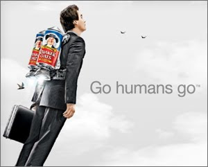
Goodby Silverstein & Partners
    
    This agency is known for it's creative and "out there" ads.  This one in particular, by the San Francisco office clearly presents that notion.  While watching it, all I can think of is a mind-map, and the endless possibilities that it has, much like the creative minds of Goodby.  This ad takes something that every company seems to advertise for, and makes it something new and innovative, purely inspirational. CLIO 2009 winner.

180 Amsterdam/180 LA

     The background story of this company is the reason why the ads are so unique.  After working at W+K some creatives were accused of working with Adidas, while they were also with Nike.  These were lies, but after being fired 180 was born and decided to make these a reality, in Amsterdam.  In one of the most-hastily made campaigns ever, this Adidas spot is amazingly creative, along with the rest of 180's work.  All of it seems to have that little something, and the will to fight for success, with fish.

GSD&M Idea City

     This company may be falling on hard times, but they are truly hall-of-fame, change-the-world kind of people after this anti-litter campaign.  After running the first spot with Matthew McConaughey this has become a phenomenon in Texas.  Sure, I heard about it before I moved to Dallas, but now...it is impossible to go anywhere without seeing this bumper sticker.  Heck, I am pretty sure people even have tattoos of this slogan.  The creativity of these Texans is courtesy of Austin, from the college the personifies Texas, UT.

Dieste Harmel & Partners


     Dieste is a company that knows the Latin market, not only that but they are creative.  This ad, from the Dallas office, illustrates how a message can be shared over a language barrier.  The chips are a tough flavor to get, but they are good.  By working in this way, Dieste can advertise to an even larger target market with less work, all together making things great for them.


LatinWorks


     This ad has character.  Though, yes it does help that I personally am fluent in Spanish, once again the message transcends language barriers.  The nostalgia in this ad is what makes it so special.  LatinWorks tends to create ads that give you feeling, like the skittles llama and they do not even need to be in your own native language.  We all grieve a lost friend, especially of the porcine variety, right?

Martin/Williams
     
     This ad from the Minneapolis is beautiful.  It showcases the artistic ability of this company without making outlandish claims or seeming redone.  The people at Martin often pick clearly dynamic ads, which can be shown by shadows and in black and white.  Not only does this ad show creativity, but it shows human potential in the way that it represents the creativity of individuals, with their hands. CLIO 2009 winner.

Monday, September 28, 2009

Responsible products

In Advertising, a company needs to portray a good message, a solid beginning, middle, and end with the product in mind, along with a strong dose of creativity to make a good ad.  Here are some examples of some good ads.  Basically, if these were my boyfriend, I wouldn't be afraid to take them home.


Example #1:
Tide Stain (Superbowl 2008)
Richards Group, Dallas

This ad is clear and to the point. Not only that but it is funny. How many times do people find it hard to understand thing because other people are in the way? Make them speak a different language and it is nearly impossible. This ad is not only considered "responsible" but it is about being responsible. Who would go to a job interview with a huge stain on their shirt and then expect to get that job? Not many people. This teaches a lesson and is good advertising.


Example #2
Nike
Wieden + Kennedy , Portland


This is a great ad. period. It adds emphasis to the normal person and empowers them for being the way they are instead of forcing some kind of change. This is what I really like about Nike, they don't sell the product, they sell the lifestyle. Plus, the ad has visual appeal with the falling words and the pretty colors. It overall just makes me feel good, and confident about myself...as I sit here writing while wearing my Nike running shorts...


Example #3
T-Mobile "Dance"
Saatchi & Saatchi London
Clio winner 2009

This ad is wonderful. It successful jumps onto the bandwagon of street dancing that seems to be going on. Then, it takes on all kinds of music, making it appealing to everyone. It also promotes a tone of unity in one of the most individualist mind places in the world, a train station. People are only thinking about their destination, usually, but here they work together. This also is not solely focused on the product but rather how it makes people feel and brings them togerther, also therefore earning the title of a "Responsible ad."

Sunday, September 27, 2009

Ethically Sound?

Sometimes ads are inappropriate.  Though perception is what dictates what is inappropriate.  For me, many ads cross the line whether they are killing, overly sexual (c'mon, kids see this stuff!), or just downright lies, they are not right. period.

Example #1
Daisy
BBDO, New York

This is possibly one of the most unethical ads of all time.  Let's scare you into voting for Johnson by blowing up a child.  Wonderful.  He won.
Example #2
Jenny Craig Kirstie Alley
JWT, New York

This ad is really just grossly inappropriate (though it seems tame at first), along with all other ads dealing with fitness and weight loss. Telling people they are fat and then giving them the "miracle cure" never works, it just makes them fatter and wanting your product again to "make it work" (think Mean Girls and the Swedish nutrition bars "It makes you gain weight...but its just water, then you lose 10 pounds like that!" yeah right, Lindsay Lohan.) What makes these ads so aweful is that the companies make it look like it is normal people saying this...and that they had similar problems, they even show you a before picture! In the commercial, they do tell you that results are not typical, but you buy the product anyway! It is all brainwashing. Lose all the weight you want for $49, yeah right...that and the gym membership...oh, and the cost of food.


Example #3:
Axe Day and Night
Lowe, Montevideo


This ad is just plain disgusting and tasteless.  Granted, Axe has gone through their share of clever campaigns, "Bowchickawowow" was odd but still sold the product.  Here, this crosses the line.  All the ad does is show the sex, it barely even mentions the product.  Yes, it does have a cool effect but all in all it is tasteless, vulgar, and demeaning to women as a whole.  Honestly, just put up sex, it is basically the same thing.

Saturday, September 26, 2009

Social Justice in the Advertising World

Many times advertising agencies will do some work for non-profit organizations to promote social justice, maybe it is to get more recognition, but these ads do seem to say 1000 words for the good of the world.


Example 1:
Publicis New England for Amnesty International


This ad is incredibly effective.  By using two billboards it already catches twice the attention that is needed.  Also, the caption reads "Make some noise for those who can't be heard" on the bottom and the woman is screaming on the top.  This ad creatively shows the mission of Amnesty International, to get the global message to spread about problems in other countries.  Also, the fact that the ad is generic on the bottom (black and white, and no racial distinction though presumably African) shows the global issue at hand while connecting it to an image of a normal, everyday girl.

Example #2
Dove Self Esteem Campaign
Ogilvy & Mather, Toronto


This commercial demonstrates the idea of "true beauty" and how the media changes that perception.  All in all, I think it respectfully lets women around the world know that even supermodels can go into the studio looking like average, everyday American women and technology changes them into the perfect dolls that we see everyday.  This entire campaign by Dove is about confidence and empowerment and overall works for social justice in an unjust world.


Example #3:
"Play Your Part" American Red Cross
sponsored by the Ad council


This ad takes one of the most debated parts of advertising, celebrity endorsements, and makes it into a good thing.  Not only that, but it plays upon a disaster, so therefore it will get people's attention.  Often times, a celebrity will make or break an ad, but here these show the humanity of these people and how they are just willing to help.  The PSA also takes another level of depth by creating the idea of a band...an American Dream, you and your friends, making a band and helping people to love your sound.  This allows for even more success in this ad, it makes the celebrities normal, and does good.


Example #4:
"Make your Mark" National Multiple Sclerosis Society
Wieden + Kennedy, New York


This campaign is about spreading awareness to a common problem in the world: multiple sclerosis.  This ad is especially effective because it makes an immediate call to action, hang the ad in your window with the letters crossed out.  This helps involve a secondary readership in a whole new way, with this campaign, Wieden + Kennedy successful spreads responsibility, without hurting or scaring others, and creates widespread participation and the sharing of a message.


Thursday, September 3, 2009

Advertising as Art

The battle rages on...is Advertising a business or an art? Well, I am going to be ambiguous and say that it is both. Do I mean that all advertising is art? Heck no. But some I do believe is worthy of the title, all it takes is a good idea and a creative presentation.

Example #1:
Clorox

Mermaids, the essence of the imagination. Original, not so much, but complete genius when associating with a bleach commercial. This design of the ad is not only profound but stimulates the minds of the viewers by playing on the evoked set of childhood memories of playing in the bathtub. DDB San Francisco seriously created a stellar ad with this very strained, yet positively workable association.


Example #2:
Quaker Oats

We all want to be superheros, right? So why don't we make an ad about it? Okay. Brilliant. Goodby Silverstein (San Francisco) of Omnicom, you did it again. This print ad screams art. Firstly, look at the realism of the man with the oatmeal jet pack...brilliant. As you get closer into observing the ad, there seems to be a theme of 2. A simple number, but nonetheless captivating. 2 simple words make this ad (honestly, it reminds me of Dr. Seuss) "go" and "humans." These are probably two of the most understood words in the English language. Also adding to the powers of 2, there are 2 jetpacks and 2 birds on the horizon, making the duplicity even more apparent in the ad. This fluidity of this number and consistency is what makes it art for me. That, and also the beauty of the clouds and color contrast. Everyt
hing is in hues of gray and the neutral color of skin, except the oatmeal, which calls more attention to the product.
Brilliant, simply brilliant.

Example #3:
Toyota Prius
This ad combines creativity with vertical advertising. Saatchi and Saatchi Los Angeles are responsible for this brilliance. By starting with the idea of those cute photographs of babies as flowers and taking it to a next step they have literally made the usually dull car commercial into a work of art. This success is taken to another level in creating instead of one cute baby picture into many and creating a living, human landscape. The synergy between these two ideas is extraordinary in this oz-worthy commercial.


Example #4:
Glassez Window Cleaner

I love the creativity represented in this ad. JWT in Spain receives the credit for this one. Not only do they take a completely exotic bird, but they do a new twist on the windex commercial. The bird is not flying into a wall, not talking, instead it seems...prepared. On another note, the bird is poised at the ready, and is the center of the visual...though not at the exact center of the ad, creating a unique way of filling space. In this case, although this is a commercial, the still version is simply a work of art through it's simplicity.

Example #5:
Citibank (India campaign)

This commercial speaks to me, and not only because I can't understand the language of the background song. As I was watching all the people sway on the commercial, I started to do the same thing. Throughout my experience, I was wondering why I was swaying so much when I realized that I had truly connected with an ad. It was an amazing feeling, and that is what art is about. This commercial illustrates the beauty of India, and then connects it by not only using English at the end but by the idea of a subway, and the swaying motion that we all feel by the experience. as far as I am concerned, this ad brings creativity and universality together, certainly making it a work of art from Publicis India group.